Shop items just for your Type from dozens of online stores.

Join Lifestyle Lifestyle members sign in here
Back to results

Pretty in Pink! Color Tips for Each Type of Woman

What’s the difference between Type 1 bright and Type 4 bold?

How do I know if a color is Type 2 “muted” or Type 3 “dirty?”

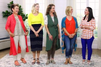
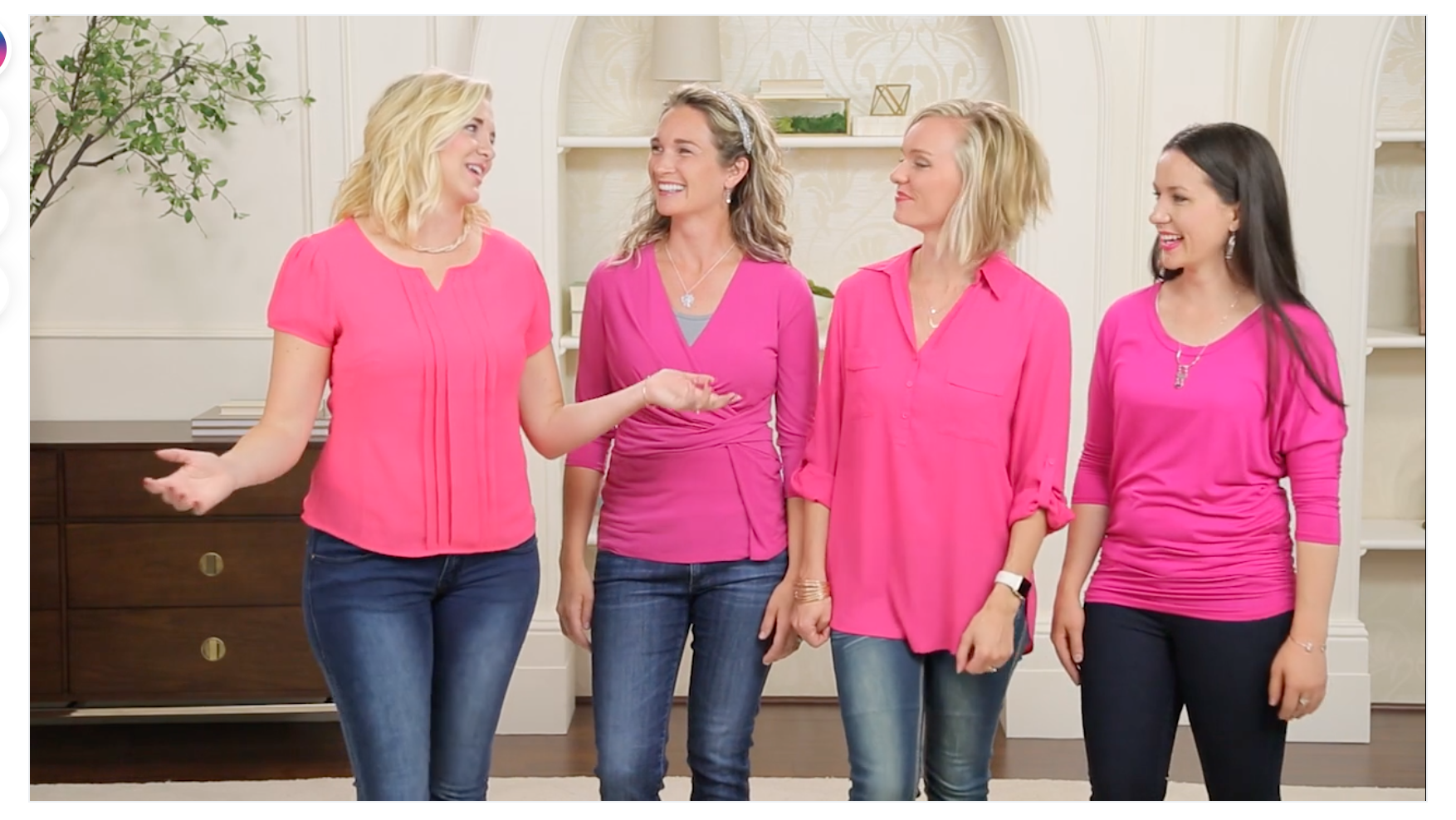
Color can be tricky.

And the Dressing Your Truth Experts are here to demonstrate how to tell the subtle (or not-so-subtle!) differences in color using pink as an example.

Find out whose colors are warm and whose are cool and what that means anyway!

Plus, watch the DYT Experts use their Style Guides to make sure their colors are on-point every time.

What questions do you have about color? Ask us in the comments!

Related Articles

63 Comments

  1. So super well done!!! I loved it. I’m been DYTing for quite a few years now, but always learn something new. At this point I guess I would say that I almost feel the difference, especially when I think about putting a color on. When you live your truth, you can feel your truth. But I definitely had a learning curve when I began. And, as always, your tips then and now really educated my eye. Thanks, ladies. You all look beautiful in pink! 🙂

    1. “When you live your truth, you can feel your truth.” I love that! Thanks for sharing, Mary Ellen!

  2. Wonderful, ladies! Great info on the subtleties of color differences for the types! I’m still learning how to discern my type one tints “in the wild” sometimes, especially when I’ve left my style guide at home, and this is helpful! Thank you!

  3. Wow, you all look so pretty!! Very informative…sometime it helps me when a color will go with my DYT jewelry or an outfit that I know was ok with my style guide harmonizes well with the color. Actually it was great to see just how close some of the colors looked so I don’t feel bad when I make an oops…:)))))

  4. I loved this segment!!! 🙂 It was so helpful, especially since each of the experts was wearing almost the same color. Would love to see more like this with other colors in the future.

  5. Thank you for an extremely helpful video! You’ve clarified a lot of things I needed help with. I think I need some more videos about colors!

    1. You’re welcome! Have you checked out the “ColorMania” videos we’ve done for each Type? We’ve done yellow, blue, red, and green. If you haven’t seen those search in the tool bar to find them.

  6. Ugh! I’m so confused. Some colors blend with my card so easily but other colors I know are type 1 colors (from the store) don’t seem to blend as easily. That makes me more frustrated because if I can’t see the harmonization on some items from the store, how am I going to see them when I’m shopping on my own?!?

      1. Jenni, how long have you been doing DYT? It takes time to train the eye to see the color and I sometimes still have questions about an item. But rather than how it looks, I put it on to see how it feels. That’s my biggest factor in deciding whether or not something works. Hope that helps!

  7. BIG QUESTION:

    1. Carol Tuttle has emphasized that any Type can wear any color value; what determines correctness is whether white, gray, black or nothing is added to the basic hue. So a type 2 and type 3 can both wear peach; the t2 color will look dusty, the t3 look rich.

    2. However, Anne and Kalista’s tops seem to be more bluish pink and Jaleah and Sarah’s more peachy pink. Kalista even mentioned that Type 2 and 4 colors have more blue, implying that certain colors, even if correctly a tone or hue, are wrong.

    #1 and #2 are contradictory.

    1. HMM, I’m not sure what you mean by color value. Every type can wear every color. As a T4, I can wear peach (light orange), but my peach is going to look different from a T1 color. I think what you may be referring to with value is whether a color is cool or warm. Is that correct? You will find cool peach colors (tends toward blue or other cool undertones) and warm peach colors (which tend towards yellow and other warm undertones). All types can wear all colors, unlike the season typing systems. We just have to find the tone, tint, shade or, in my case, hue! It’s a process and I’m still working on it!

      1. Hi Lori,
        Yes, you are correct. Undertones is the word I needed.
        Whether a color has more blue or yellow undertones shouldn’t matter; whether it has added white, gray, black or is a pure hue does.
        However, it seems like Anne and Kalista had more blue undertones in their pinks; they weren’t just starting with the same hue. Kalista even mentioned Type 2 and Type 4’s needing more blue and less yellow undertones.
        Can someone from DYT explain this? Thanks!

    2. I thought the same way until I bought a peach skirt online. Somehow it just wasn’t right and I decided it was type 3. I’m type 1 and it just didn’t work. It is a “warmer” peach, I guess you would say, but it does have a little bit or “richness” or something to it. I wasn’t sure of the problem with it until I saw this video. But I still agree with you a little that it is confusing because you take color and add white to get a tint is what we have been taught . . not anything about the blue in it.
      Sometimes videos like this make me feel more confused, but also make me realize why I have some tops I thought were type 1 that maybe I don’t feel as good in, or feel like they stand out, not me. Just wanting to let you know, I hear ya! 🙂

      1. Thanks for sharing your experience, Melissa. I am sure that, in addition to following the DYT rules for our energy type, most women find that certain versions of the same color work better than others. For example, I am a type 2 but I look and feel much better in a soft peachy pink tone than a more bluish pink tone. This is the reason I sat up and took notice of Kalista’s comment about Type 2s and Type 4’s needing more blue in their pink. Not my experience.
        I do look forward to the DYT gang’s response to this question!

        1. Hi Carol D,

          I hope I’m understanding your questions correctly… “1. Carol Tuttle has emphasized that any Type can wear any color value; what determines correctness is whether white, gray, black or nothing is added to the basic hue. So a type 2 and type 3 can both wear peach; the t2 color will look dusty, the t3 look rich.”
          This is correct. Any Type can wear any color, true to Type.

          “2. However, Anne and Kalista’s tops seem to be more bluish pink and Jaleah and Sarah’s more peachy pink. Kalista even mentioned that Type 2 and 4 colors have more blue, implying that certain colors, even if correctly a tone or hue, are wrong.”

          When we get into our Type’s version of that color – in this case, pink, we will see differences across the board. Because of the warmth added Jaleah and Sarah’s will lean a different direction (more peachy) that mine and Kalista’s top.

          So Carol says, every Type can wear Pink – yes that’s true! Every Type can wear many versions of pink – yes, that’s true. Will you be able to find a peachy-pink for Type 2 and Type 4, probably so, but it’s not quite as common, so for this video we used the more bluish pink.

          I hope that helps clarify things for you.

          1. Hi Anne – you took time from your very busy schedule as a mother of 2 and major support of the DYT Type 2 world to answer my question in wonderful t2 detail – and I appreciate that. Unfortunately, I still hear a contradiction to my experience and the overall DYT philosophy. I hope the following will clarify:

            The word “coolness” as it is used in the Type 2 DYT world appears in 2 different and unrelated ways:
            1. Coolness caused by adding gray
            2. Coolness caused by adding blue undertones

            It sounds like DYT is advocating that type 2’s stick with versions of a color that have bluish undertones in addition to the normal gray. This IS NOT my experience. I feel aligned in any softened (grayed) color, but I definitely look and feel better if there are yellow undertones. Blue undertones make me look pale and feel too yin.

            For the record, I am able to find more softened (grayed) peaches than I do softened bluish pinks, but that may because I’m looking for them. We tend to see what we seek.

  8. Jalea and Sarah, you are all so vivacious! Thank you! I recently realized that I am a T1, and so I look for the white bouncing off my outfit and I look for circles more than when I thought I was a T3, I was looking for saturation and triangles. Miss you, Sarah, as my type spokeswoman, even though I love Jalea. <3

  9. I have one problem with the video. I fell in love with Anne’s top but I am a T4. (I must confess I even went in the Type 2 Store to see if I could find it but, probably fortunately, it was not there.) Seriously though, this video was very helpful; thank you.

  10. Would DYT consider making supplementary style guides for different color groups(reds, pinks, greens, blues, etc) for the 4 types to be sold in the DYT store?(or for Lifestyle members). This would give us more references and confidence while shopping and learning what the correct colors for each type are…I know I would be willing to purchase these because it would help me save money in the long run by purchasing correct colors if I’m not shopping at DYT store or using style finder. Love the video resources however the colors don’t always represent the same on screen.

    1. Totally agreed on this. I would gladly pay for supplemental color cards for my energy type. Where I seem to be tripping up sometimes is with reds, pinks, and corals, so I would definitely buy those supplemental color cards if they were available!

    2. Something you could do now is go to an art store and buy a color wheel. It will show the hues, tints, shades, and tones. I keep one with my DYT card in my purse.

  11. Oh you guys are so fun together! I think as a Type 1 I can have problems where I see all the tint, shade, hue, and tones being able to harmonize with the Type 1 style guide. It’s easier for me to see Type 2 and Type 3 by asking if the color looks softened, or if it looks dirty.

  12. Altho I don’t need it much now after years of using the style guide and I guess my eyes are now “calibrated” to read my energy on a piece, in the event of a close call, I still carry the small card in my wallet. I find tho that if I am uncertain in a store, I’ll just throw the piece over my shoulder and “wear” it that way for a while. Generally, if it’s not me, it will start to feel uncomfortable just by proximity…

  13. Super helpful to have all four color profiles together! Thank you so much for doing this video, DYT team. Please do more fun tutorial videos like this that include all four energy types together! Personally, I feel like one of the most effective ways to learn about one’s own style guide and color palette is to learn about the other types, too. This has allowed me to identify what type, if any, a garment “in the wild” is. I now know how to identify a 1, 2, 3, and 4 (and a “nothing!”) right off the rack, and that skill is REALLY helpful because it means I don’t accidentally buy an item that isn’t my energy type. It’s kind of like how the more you learn a second language, the better you know your native language. Learning about the other style guides helps us learn our own even better. Thanks again for this fantastic video!

      1. I’m glad you found this video helpful! We will continue to create supportive content like this one.

        1. I love this video!!! It would be fun to have more in this format with green or blue tops, etc. This is one of my favorite videos so far showcasing the four types and colors side-by-side!!!!

  14. I really enjoyed this video! It was so informative and fun to watch. As a type 2, I am always wondering if a color is gray enough and so I really appreciated seeing Anne’s vibrant pink top. However, I did notice that of the four ladies, her top is the only one that is not available in the dyt store. I personally would love to see a lot more color variety in the type 2 store. There are so many neutrals like taupe, gray, and brown items in there right now. Its kind of a bummer.

    1. We’re always looking for more vibrant Type 2 tones. I think some of the newwest arrivals in the store hit the spot! Envoy of Love Top, Daisy Divine Top and the Nanday Parakeet Tunic feature some fun brighter pops of color. https://shop.liveyourtruth.com/clothing.html?___store=type2

      Here’s a link to the top I wore in the video: https://www.amazon.com/Ellen-Tracy-Womens-Sleeve-Twist/dp/B0192U74ZW/ref=sr_1_1?ie=UTF8&qid=1471111709&sr=8-1&keywords=Ellen+Tracy+Women%27s+3%2F4+Sleeve+Twist+Top

      1. Thanks so much Anne! I appreciate you sharing the link to that pretty top. I’m going to give it a try. It looked so cute on you!

  15. I think as a fine artist it’s easy for me to understand this presentation. I’ve learned today that DYT is a true art form with our own selves as the beautiful masterpiece! Cliche but true in these forums. It might even help people who aren’t artistically inclined to read up on color theory or to buy some cheap oil paints and experiment to understand their types. It’s so perfect how all of their words match up with the DYT philosophy in this video —that gray softens a color in the way that water erodes, how white uplifts in the way that fog clears, the reflective shimmer of our skin when kissed by the fiery sun, and how ever-present, in full totality, a commanding and saturated rainbow can be. <3

  16. This was so helpful. I had decided I could not wear pink but now I know it’s a matter of finding your type’s pink! I love pink so this is good news.

  17. It’s subtle, but one thing that I really like that you did with this video verses some of the other DYT videos I’ve seen is had each type take a turn being the authority on the subject for the whole group and being the boss of the discussion for lack of a better term. Most of the time we see our type experts being the leader for discussions for our own type only. Carol is always saying that as you live true to your type that people will respect that energy more and it will lead in its own way but I feel like we never get a chance to see what that actually looks like. Since we don’t get to see it very much in the videos, it feels/sounds more like take it on faith and just trust me that it will which can be harder to swallow when you’re unsure of the value of the program. Most of the other videos either have Carol leading, Anne leading, or its for a single type audience. I felt like this was a great demonstration of how each of the types show up as leaders in their own way and what that looks like when being the leader in a group of multiple types. It like to see the different leadership styles and how it affects or plays off the different energies in the group. This would be great to see more often.

  18. You all outdid yourselves with this one. This is one of the most supportive videos I’ve seen for the DYT system, and seeing everyone in full blossom was a joy.

  19. You guys are just SO AWESOME!!!! I especially love the humour and relaxed tone with which you share this amazing information!!! You basically rock!!! xoxoxo

  20. This is really helpful- I likely would have picked the type 3 pink as a type 4 neon color if left to my own devices.

    After hearing more about the colors… would it be a fair statement to say type 4s are more restricted in the range of colors we can wear? For instance, with a type 1 pink you can add a little to a lot of white and get a variety of tints, and same for the other types. Whereas with type 4, it’s either the pure hue or nothing at all. Am I understanding that correctly?

    1. Yes, this is somewhat true. We do have a range within each color, but it is a much more narrow range. Our variations happen when two pure colors are mixed. For example; one green could be more blue, and another could be more yellow, with both still being true hues.

  21. That was the cutest thing ever. I loved the shuffling 🙂
    So, um, I still get stuck on 1 vs 4 and then I get stuck with thinking that a “lush” cranberry or peacock green are “bright” when they are technically jewel tones. arg.

  22. This was really well done! Really gives the definitions of the different types and how the chroma works and all in my new favorite color!

  23. Not so much diffrence with these pinks. They are all so very bright.
    Type 1 a tint, type 3 a shade — hardly visible at all. Must be a
    color pro to see this.
    Why not present pink shirts that really are different in colors as
    to tint, tone, shade and pure????

Leave a Reply

Your email address will not be published.