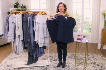
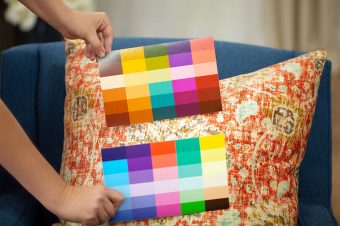
Color is such an essential part of the Dressing Your Truth experience, but sometimes it’s hard to tell if a color is a bright, Type 1 tint or a bold, Type 4 hue!
This is where your Style Guides come in handy. When you have the right tools at your fingertips, I’m confident you’ll train your eyes and find beautiful colors perfect for your Type of beauty.
Examples in Colors:
Sometimes colors vary depending on your monitor settings. Use your Style Guides so you always pick the correct colors for yourself!
Discover more color true to your Type of Beauty:

Thanks for this video! Super useful. And you are such a great teacher!
Thank you!
This tip though about if it’s overpowering it’s probably a type 4 is confusing though because I’m a type 1 but there are some type 1 clothes that are definitely overpowering on me. They’re so bright they hurt my eyes and you see the brightness way before you see me. So it seems even colors of your own type can be too much at times.
Jenni, if you’re a 1/2 you won’t be as drawn to the brighter Type 1 tints. You’ll feel better in the lighter versions. Choose to wear the colors that naturally feel best on you.
Ok, thanks. That makes sense. I think DYT is so much better now than when I first started. Back then brining your secondary into your style wasn’t talked about that much and when an aspect of a type didn’t fit I just figured I couldn’t be that type. Because of that I couldn’t find any type I fit into. Now if something doesn’t work I just have to ask myself if it could be because I need more influence from my secondary 2.
That might be why some T1’s drop out being T1’s because they don’t understand why they are not into the brighter tints… They must be 1/2’s… Thanks for the insight, Anne!
Finally! Thank-you! I’ve been waiting so patiently. I always over analyze colours because I would not like wearing a tint thinking it is a hue. It will take more practice, but hopefully I can get it all right one day.
Thank you for these videos that compare the different types of colors! I’ve started buying clothing for my t1 husband, and it is tricky for me when some t4 colors can look bright to me. He looks amazing in the tints, but overpowered by the hues…I like the idea of t1 colors being sunbleached, and t4 colors are clean and reflective. T1 colors look juicy to me, while the t4 colors look kind of like stained glass or something…
Nice! I love the juicy vs. stained glass analogy! And I agree- this video is super helpful. Before DYT, I had noticed how some colors are just too saturated on me. Now I understand why, and have a easier time identifying T1 colors.
Is the T1 orange shirt in the store?
Yes! It’s cataloged as a “dress” but could definitely be worn as a shirt, like a tunic. It’s lovely – very soft and really nice knit to it. https://shop.liveyourtruth.com/clothing/dresses/type-4-fall-has-arrived-dress.html?___store=type4
Oh haha! Just realized you asked about the Type 1 shirt, not Type 4. Haha. Here it is! https://shop.liveyourtruth.com/clothing/tops/type-1-jubilant-laughter-top.html?___store=type1
Thank you thank you! So cute!
Will you be getting more mediums in stock?
Thank You, Thank You, Thank You. As a new T1 I have been second guessing if something is bright or bold particularly reds and yellows. This video was so helpful. Thanks again Carol and the DYT team fro such great and useful content.
Wow, really helpful content, thank you! It’s a reminder to still have my Style Guide on me when shopping – I’ve realized from this video that recent purchases that I’ve too easily assumed were my T4 colors in the stores, are in fact T1. Super helpful. I’m now going to carry T4 AND T1 pocket guides in my purse to prevent this error.
Also, outstanding video production – loved the T1 & T4 style guides positioned back to back for a quick flip, as well as the slick flip of the garments. Well done Carol and team!
Thanks Carol. Great teaching. Quick question? I joined dressing your truth quite a few years ago and because I have had a lot of difficulty discerning what my type is I have never requested the colour guides. I would really like to do that now. How do I go about it? Many thanks.
Please email support@dressingyourtruth.com and they will gladly help you with this request.
Thanks Carol.
Ugh! I can see the difference with everything but the red. I think I might just have to get red items from the store. I don’t know why that one color is so hard for me (lol).
Yes, thank you Carol!!! I’ve been thinking for awhile now that I’m a 1/3 and this video helped me so much in noticing the differences now between bright and bold. <3
Excellent demonstration! I love how you used the colour guide to show how to tell the differnece. Thank you Carol.
You are welcome. Thanks for sharing.
I usually have a harder time telling the difference between “rich” and “saturated.” I know some T4 hues are dark, and it’s hard for me to tell if it’s still a saturated T4 hue or if there is black added to make it a T3 (tone or shade; I don’t remember which). For example, I would have liked to see that purple top next to a T3 style guide. I can often tell the difference if the clothes are right next to each other, but it’s harder in a store (or especially online!).