“Is this color Type 2 or Type 3?” You’ve probably asked yourself that question—even when you’ve had the Style Guides in your hand!
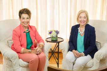
Type 2 tones look dusty, and Type 3 shades look dirty. It’s possible that sometimes a color looks like it belongs to both Types. Sarah and Anne give you all the deets on how to make the decision in confidence. Watch how you can “Type-ify” the same shirt to make it work for you.
Want your own Style Kit? Buy it today!


Great video – so helpful! I have a question though: I lean toward the darker Type 2 tones that border or crossover to Type 3. Is this an indication that Type 3 is my secondary? I have thought that I was a secondary 4 for the longest time. But I don’t love stripes and I don’t colorblock as much as I used to. I love pointelle and cable knit sweaters and cardigans and textured lace and I always have! Thanks again!
I’ve found that 2/3s are drawn to the darker tones, as Type 2/1s are more drawn to the lighter tones, and for 2/4s they play in both well. The fact that you like texture is also an indicator that your secondary could be a Type 3. Try it on and see how it feels.
Thanks, Anne. I will make an extra effort to dress 2/3 this month and pay attention to how that feels.
I’ve noticed that SO MANY garments with an army camo print are in the dustier tone of Anne’s sample jacket, and not rich shades at all. It is very helpful though to see that there are some colors that ride the line for when both T2 and T3 pattern guides seem to harmonize.
Thank you for this very helpful video. I have a jacket that is the right ‘color’ (soft olive green) I kept it because the color blended with my original color chart. However, I never wear it, because it looks like a dude jacket on me. I feel like I should be carrying a weapon or heading into combat every time I put it on.
Ive noticed that a lot of the colours I choose are crossover colours for a type 2 and a type 1 or a type 2 and 3 or a type 2 and 4 .Im also noticing that a lot of the style I go for is type 2 and type 4. I’m always going for simple and plain and soft and comfortable with loose structure and flow . Jewelery is interference and busy and I usually end up takling it off. hmmm this is intersting and made me ponder . my sense is that I havent yet landed in my true type yet. One day it will be really obvious im sure and I keep allowing and opening the space for that possibility . I’m about 4 years into this now …. and am probably quietly working my way through the different combinations. But I do notice what is consistenly true … I keep coming back to type 2 colour because if i go too far into the colours of the other types they begi to feel off and I keep coming back to a secondary 4 because that is what shows up in my style and I do have the thign where I feel everything acutely in my body . And I do notice in my head the desire to be have a higher energy type more dominant but its appearing to not be the case, my body doesnt repsond to that thought . In the past Ive tried hard to have more energy and end up utterly exhausted.
This was such a great video, so helpful!
That green. It’s my green, and when I wear it I feel fabulous. It’s so great to see DYT honing in on specific sticking points, especially these ideas of cross-over colors and choosing darker colors for Type 2. Very validating to my Beauty Sixth Sense.
Thanks Sheryl.
Thank you for this! I have a dress that I love, exactly that shade of green! I’ve been reluctant to wear it because it seemed to veer close to Type 3. Now I know why! Another helpful video. Thank you.
You are welcome! Glad you kept that dress!
Love this! I’m going to revisit some pieces and use these helpful tips. Thank you!